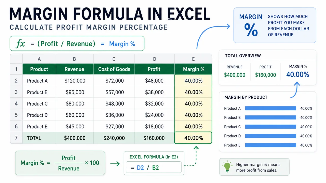
A standard deviation graph helps you show spread, not just average. An average tells you the center of a data set. Standard deviation tells you how far values usually sit from that center. In Excel, you can visualize that spread with a line chart, column chart with error bars, or a bell curve style helper table. The best choice depends on whether your data is a time series, a category comparison, or a distribution.
The calculation starts with two formulas. Use =AVERAGE(range) for the mean and =STDEV.S(range) for a sample standard deviation. Use STDEV.P only when your range is the full population you are analyzing, not a sample. Many business spreadsheets use STDEV.S because they are working with observed records from a larger process.
The graph should be built only after the data range is clear. Do not mix totals, percentages, and counts in one standard deviation calculation. Do not include blank spacer rows. Do not include a grand total row at the bottom of the data. Standard deviation describes variation inside one comparable set of numbers, so the first step is making sure the range actually represents one set.
Prepare the worksheet
Put the values you want to analyze in one column. If the graph is a time series, keep the time labels in the column next to it. For example, month names can go in A2:A13 and scores can go in B2:B13. In a helper area, calculate the mean with =AVERAGE(B2:B13) and the standard deviation with =STDEV.S(B2:B13). Then create helper columns for mean, upper band, and lower band.
If the mean is in E2 and the standard deviation is in E3, the helper values can be repeated down the chart rows. Mean line: =$E$2. Upper one standard deviation: =$E$2+$E$3. Lower one standard deviation: =$E$2-$E$3. For two standard deviations, use =$E$2+(2*$E$3) and =$E$2-(2*$E$3).
Create a line chart with standard deviation bands
Select the label column, the value column, and the helper columns. Insert a line chart. The main value line shows the actual data. The mean line shows the center. The upper and lower standard deviation lines show the usual spread. Format the mean line darker and the band lines lighter. This type of graph is excellent for quality control, monthly performance, daily response times, forecast errors, and any process where you want to spot unusual movement.
Create a column chart with error bars
If you are comparing categories rather than time, a column chart with standard deviation error bars can be clearer. Put categories in one column, averages in the next column, and standard deviations in a third column. Insert a column chart from the averages, then add error bars. Choose custom error amounts and point both the positive and negative error values to the standard deviation range. Each column then shows the category average, while the error bar shows spread.
This is useful for comparing teams, products, stores, campaigns, or experiments. Two categories may have the same average but very different variability. A category with a small standard deviation is more consistent. A category with a large standard deviation is less predictable. That distinction is often more important than the average itself.
When adding error bars, avoid accepting the default percentage error bar unless that is truly what you want. For a standard deviation graph, choose the custom option and point Excel to the cells containing the standard deviation values. If all categories use the same standard deviation, the same cell can be used for each bar. If every category has its own standard deviation, use a range of standard deviation values that lines up with the charted categories.
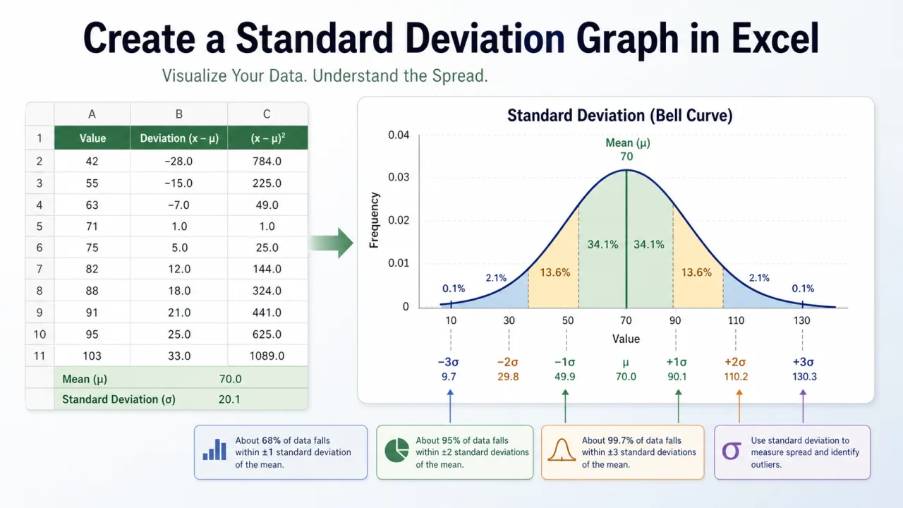
Build a bell curve style graph
For a distribution view, create a helper column of x values around the mean. Then use NORM.DIST to calculate the curve height. For example, if the x value is in A2, the mean is in E2, and the standard deviation is in E3, use =NORM.DIST(A2,$E$2,$E$3,FALSE). Fill the formula down and insert a smooth line chart. Add vertical markers for mean, plus one standard deviation, and minus one standard deviation.
Interpret the graph carefully
A standard deviation graph does not automatically prove that a value is good or bad. It shows distance from the average. A high value can be positive for sales and negative for defects. A low value can be a warning for revenue and a success for response time. Always interpret the chart in the context of the metric. Label the chart clearly so the reader knows whether higher is better, lower is better, or consistency is the main goal.
Also check whether the data should be grouped before calculating spread. If you mix different products, regions, or seasons in one calculation, the standard deviation may look large only because different groups naturally behave differently. Clean date labels, such as those from writing month as number in Excel, can help keep chart categories sorted correctly before you analyze variation.
The practical workflow is: clean the data, calculate the mean, calculate the standard deviation, create helper bands, insert the chart, and format the lines so the message is visible. The formulas do the math, but the chart design decides whether someone can understand the result quickly.
Formatting checklist
Use a descriptive title that names the metric and period. Keep the actual data line visually stronger than the helper lines. Use dashed lines for the mean and standard deviation bands so the reader does not mistake them for real observations. If the chart contains an outlier, label it directly instead of forcing the reader to compare it with the axis. Finally, keep the vertical axis scale honest. A chart with a compressed axis can exaggerate small changes and make normal variation look dramatic.
A good standard deviation graph should answer two questions quickly: where is the center, and which values sit unusually far from it? If the chart makes those two points obvious, it is doing its job.