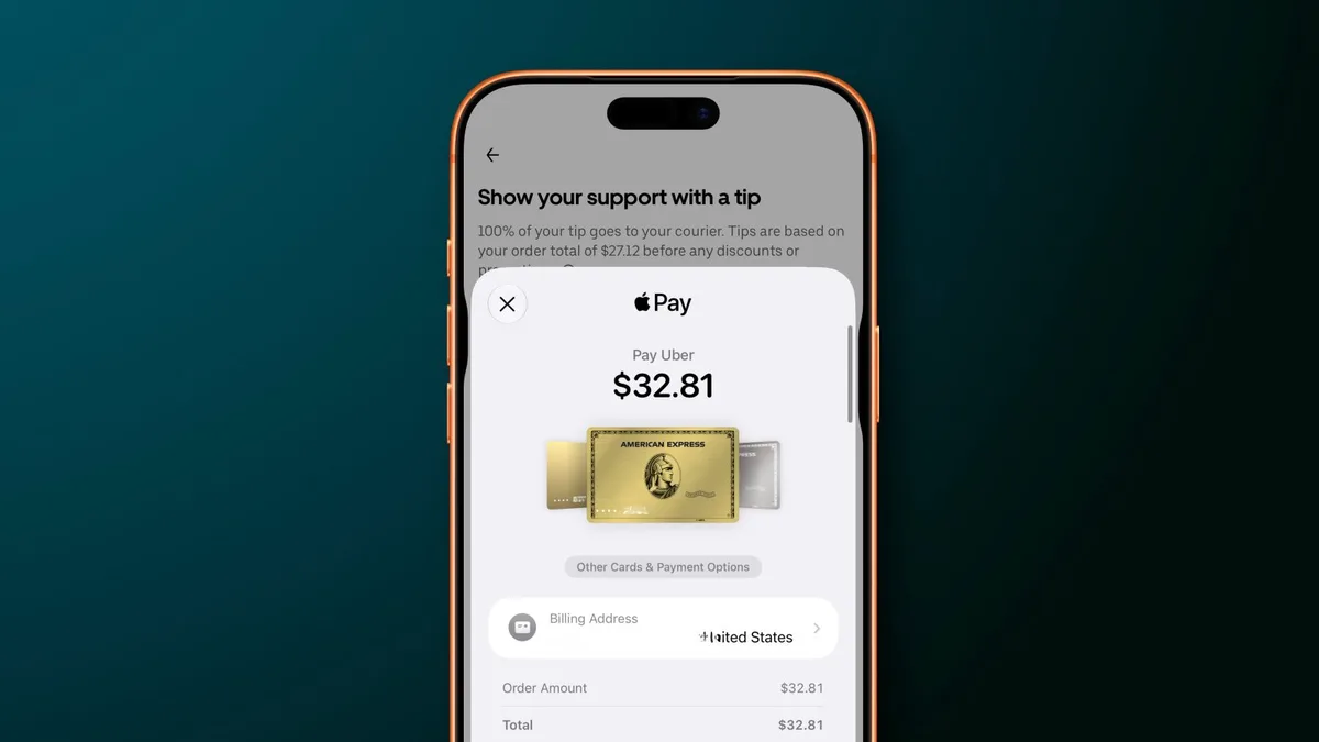
Mobile payments are judged in seconds. If checkout feels smooth, nobody thinks about it. If the wrong card appears, the flow becomes annoying immediately. That is why small interface changes in Apple Pay can matter more than their size suggests. Payment software sits at the point where convenience, trust, habit, and money meet.
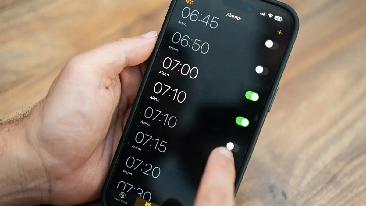
Card switching is one of those everyday frictions that rarely makes a keynote feel dramatic, but it affects real use. People carry different cards for travel, business expenses, rewards, subscriptions, family purchases, transit, and backup. A checkout flow that makes switching awkward can cause hesitation at exactly the moment a payment product is supposed to feel effortless.
9to5Mac reported that iOS 27 makes it easier to switch between Apple Pay cards in apps and websites. The change sounds narrow, but it fits Apple's broader advantage: improving small interactions across a huge installed base.
It also fits the larger Apple Intelligence and software theme we covered in the Apple Intelligence WWDC update. Not every useful software improvement has to be branded as AI. The strongest platforms often win by removing tiny points of friction from tasks people repeat constantly.
For merchants, smoother Apple Pay behavior can reduce checkout abandonment. Any extra step in payment can cost sales, especially on mobile where attention is short and forms are unpleasant. If users can confidently pick the correct card without leaving the flow, the payment experience feels more professional and less risky.
For users, the privacy and control angle matters too. Payment choice is not only about rewards. It can reflect budgeting, separation of work and personal spending, or a desire to use a specific card for protection. A better card switcher gives users more confidence that the transaction is going where they intend.
The change is a reminder that platform maturity often arrives through polish. Apple Pay is already established, so the next gains come from making common actions feel obvious. A better card switcher will not transform mobile payments by itself, but it may remove one more moment where checkout feels like work. That is exactly the kind of detail that keeps people using a default wallet.
The improvement also shows why wallet platforms are hard to dislodge. Once a payment system becomes trusted and convenient, every small refinement deepens the habit. Competing wallets may offer rewards or bank partnerships, but they have to overcome the default flow people already know. Apple does not need to reinvent checkout every year. It can keep tightening the path from intent to confirmation. In payments, shaving off a moment of uncertainty can be enough to make the platform feel safer and faster than the alternatives.
Banks and card issuers should welcome this kind of polish too. If users can choose the right card more easily, rewards programs and specialized cards become more usable. The wallet becomes less of a default-card tunnel and more of a genuine payment selector. That makes mobile checkout more flexible without making it feel slower.
Small payment details can decide whether users trust the flow.